Solo Project
Experimental Design | Visual System
UI Design for Tesla
Project Overview
It is important to understand what needs to be at the touch of the driver’s fingertips to provide safety and usability of interface that user’s will be experiencing in everyday. This project requires deconstructing existing car UI interface to see what works well or what part needs to be redesigned or improved to provide a good user interface design.
Car Deconstruction
Information Architecture
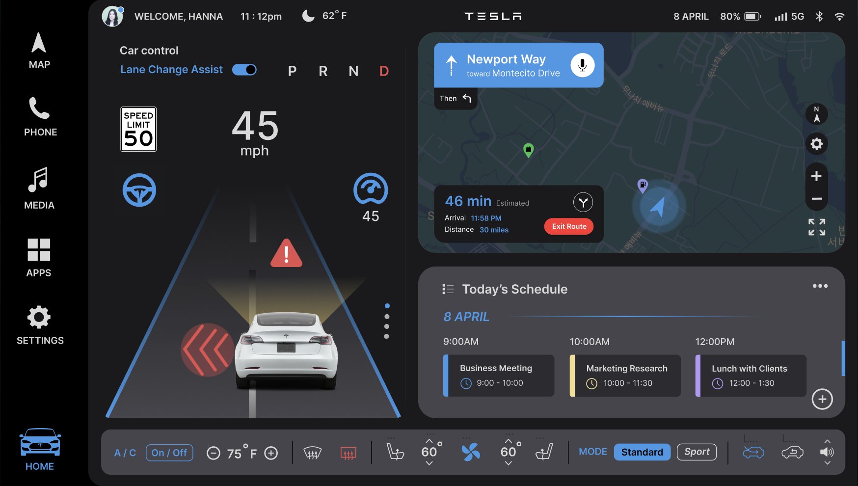
I deconstructed Tesla Model S UI interface system to see how screen works and what panel needs to be redesign in order to provide good interface experience to the users.
Tesla Model S Intro
Research Survey
Design system (UI)
Tesla’s mass-market strategy
Tesla is establishing an affordable price range through continuous technological development. The company stands out from other electric car competitors by offering high accessibility and convenience through the integration of various devices and a focus on intuitive graphics. These advanced features provide users with an exceptional experience, strengthening their connection with the brand.
Key characteristics of current UI
Conducted Via Google Survey Form
Tesla Model S in the market
I came up with the user survey questions for my research, which helped me better understand users' needs for their car interface. By conducting surveys, I was able to design a user-friendly car infotainment system and gain a more in-depth understanding of users' opinions about their current car UI interface system.
Learned about a type of user…
Based on the collected data from the survey, I used the empathy map to group the results into four categories: Thinking / Feeling, Saying / Hearing, Painpoints / Frustrations, and Wants / Desire. By using an empathy map, I was able to understand in user’s point of view of experiencing the current UI interface.
Persona
Workflow Diagram
Information Architecture
Overview of Screen Layouts
Wireframes
Low-Fi
High-Fi
Driver Profile Page
There is no end and perfection in design
Takeaways
Car Infotainment System - UX Design
Final Deliverables
Auto parking system*
Map Panel
Customize Screen Layout
Music/Entertainment
Lane Change Assist*
What I’ve learned from this project…
Conclusion
Phone Calls/Contacts
Customize (Add Display)
The entire project took nearly three months to define and design the most important, user-centered features for drivers to experience on the road. During the process, I deconstructed existing car interface systems, conducted user surveys, and created personas based on the survey results. While there were challenging moments in improving the current UI system, I enjoyed the design process and gained valuable insights into the features users truly need.
There is no such thing as a perfect design; designers must truly learn from users by conducting research and testing to ensure usability.
Key questions that contributed to the design solutions
Summary
Empathy Map & Persona
Demonstrates a real user experience


